


As we look ahead to 2026, colour will continue to play a powerful role in how we express mood, personality, and intention in interior spaces.
The coming year is all about harmony: soft warmth meets quiet drama, natural tones are elevated, and bold accents return with confidence. Whether you’re redecorating a single room or rethinking your entire palette, these six key colour trends are set to define the year ahead.
Neutrals will always be timeless but we do expect their popularity to continue to wane slightly. The rise of personality-driven interiors has meant we're no longer afraid of colour - even if the brightest of shades might still be a rare sight.
From grounding greens to sun-warmed yellows, discover the colours that will shape 2026 - and how to style them in your home.
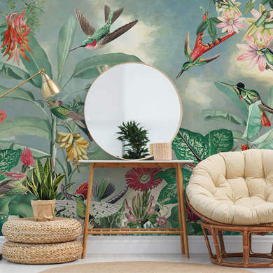
Golden Hour

Golden Country Bloom wall mural
Golden yellow takes centre stage in 2026, but not in its brightest, zingiest form. We began 2025's colour trends blog with rich yellows and we expect similar shades to still be popular in the new year.
Golden Hour is a mellow, sun-drenched hue inspired by the last light of day - warm, nostalgic, and gently uplifting. It’s a yellow with a vintage softness, making it ideal for spaces where comfort is key.
Use it in dining rooms to create a welcoming glow, or in bedrooms for a gentle start and end to the day. Bring it into the bathroom for a peaceful space where you can relax and recharge.
Pair with terracotta, cinnamon tones, or creamy neutrals to enhance the warmth. If you prefer contrast, deep teal or soft lilac can balance it beautifully. Golden Hour also works well with mid-century styling and natural wood finishes for a grounded yet retro feel.
Silvered Green

A sophisticated evolution of sage, Silvered Green is set to be one of 2026’s most calming and adaptable colours.
With subtle grey undertones and a slightly chalky finish, this shade is rooted in nature but feels contemporary and refined. It brings freshness without being cold and depth without feeling dark.
Silvered Green excels in bathrooms, bedrooms, and open-plan kitchens where tranquillity is the goal. As more of us look to the natural world for decor inspiration, this is a shade that helps to blur the line between outside and in.
Complementary shades include warm neutrals like clay or putty, cool whites, and soft blush tones. It also pairs effortlessly with aged brass, fluted wood, or stone textures - making it ideal for minimalist interiors with a touch of softness.
Velvet Plum

Rich, romantic, and just a little bit dramatic, Velvet Plum invites personality and atmosphere into any room.
This deep purple hue draws on the luxury of velvet textiles and the natural richness of autumn fruits. It’s bold but not overwhelming, and it feels especially current in 2026’s trend toward moodier interiors.
Ideal for living rooms, dining areas, or boutique-style bedrooms, Velvet Plum looks stunning when teamed with burnt orange, dusky rose, or muted gold. Just look at the complementary tones in this floral wall mural from designer Uta Naumann. The dark blues and autumnal tones pair with the deep purple beautifully.
For a modern update, try pairing it with soft grey or dark green for a layered, expressive palette. Use it on accent walls, in velvet cushions, or even in bold wallpaper designs to introduce a sense of depth and indulgence.
Poppy Red

Vibrant and full of energy, Poppy Red makes no apologies. It’s a punchy, retro-inspired colour that instantly commands attention, bringing life and energy to even the simplest spaces.
This is the red of classic signage, 60s design, and modern art - unapologetically bold, yet strangely versatile when used in the right way.
Use Poppy Red in home offices, creative studios, or kitchens where you want to spark motivation and conversation.
It contrasts beautifully with baby pinks, olive greens (see above), and soft beige for a playful, layered look. Alternatively, pair it with monochrome accents for a sleek, graphic finish. For a more curated feel, introduce it through artwork, cabinetry, or a single painted wall.
Tidal Teal

Striking a harmonious balance between cool and warm, Tidal Teal tempers the majestic power of the sea with the grounded calm of the forest.
It’s immersive and comforting, making it a standout choice for 2026. Unlike more saturated teals, this version has a dustier edge, allowing it to slip easily into both modern and rustic spaces.
Perfect for lounges, bedrooms, or spa-inspired bathrooms, Tidal Teal pairs beautifully with warm metallics like brass or copper, and earthy materials such as jute or rattan. It's a versatile starting point from which the possibilities are endless.
Lighter tones like sand, oyster, or pale peach soften the look, while near-black or walnut wood finishes will bring out its depth. It’s particularly effective in layered textures - think velvet sofas, textured feature walls, or mural-style wallpapers.
Near Black

The final trend is not a colour in the traditional sense, but something adjacent to black. Near Black is a deep charcoal with undertones of navy, forest, or brown (see above). It can show slightly different hues depending on where the light is hitting it.
It’s more forgiving than pure black but just as impactful, offering a dramatic foundation for interiors that want to make a statement.
This shade is incredibly versatile: use it in kitchens for a sleek, architectural look, or in bedrooms and living rooms for a cocooning effect.
Pair it with creamy whites, dusty pinks, or warm tan tones for balance, or go all in with tonal greys and moody blues for a gallery-style aesthetic. It also highlights textures beautifully - from plaster walls to matte ceramics and soft fabrics.
Which Colours are on Your 2026 Mood Board?
2026’s colour palette is grounded in nature, layered with warmth, and designed to invite both calm and character into our homes.
Whether you’re drawn to the luminous glow of Golden Hour or the sultry richness of Velvet Plum, the coming year offers something for every taste - and every room. These are colours that complement, not compete; that elevate, not overwhelm.
As we move into a more self-expressive approach to interiors, the key is choosing tones that reflect not just trends, but how you want to feel in your space. And with this palette in hand, there’s never been a better time to experiment.
So, which of these tones is making its way into your home decor? Is there a colour we missed that you think will dominate the design sphere for the next 12 months? Let us know in the comments down below!
![Wallpapered Bathrooms [Why Everyone is Obsessed!]](/images/blogs/Wallpapered-Bathrooms.jpg)
Latest Social