


Some people say that the kitchen is the most important room in the house. But aren’t as many memories made in the living room? From cozy nights in with loved ones to your baby’s first steps or everyone opening presents on Christmas morning, many happy events happen in your living area.
For many, it’s the first room they look at when they’re buying a house – and it’s often the first room that people decorate. Living room color schemes can set the tone for the rest of the home, so it’s important to get this right. Whether you want warm and cozy, light and airy, or cool and quirky, your color palette should look and feel great and represent you.
Need a bit of inspo? Here are some living room colour schemes to help you make your home totally dreamy.
Navy living room color schemes for a relaxing, grown-up area

The very first color trend we need to talk about is the navy living room, an interior concept that isn’t for everyone but has so much potential for those willing to give it a go. We admit, navy isn’t the most accessible color choice for the home, as most people are looking for ways to make their homes feel light and airy. So surely, navy is just counterintuitive?
Well, we’ll let you in on a little secret. Done right and navy can actually be super sophisticated, wonderfully modern and a great mood adjuster. Firstly, blue color schemes tend to be cooling, helping to relax and declutter the mind. For south-facing living rooms that tend to get hot in the summer, blues can actually make your room feel cool, and as a result, seem more spacious and comfortable.
Blues, like this navy seen on the Indigo Garden 1 wallpaper, can also be very calming, making everyone feel at ease. Blue is universally loved and generally keeps people happy.
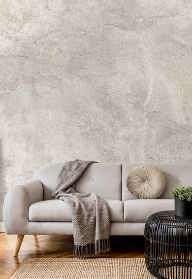
Cream and green for peace and mindfulness

Green is the color associated with nature and it’s known for its soothing and calming effects. This makes it perfect for a communal space like the living room. Combined with cream, green color schemes are extremely elegant. They create a sense of spaciousness and help to cure all manners of melancholy or malaise.
This floral wallpaper is an eye-catching example of how nature can be incorporated into your living room.
If you’re looking to create a luxurious high-end feel, invest in quality upholstery. Cream can be very one-dimensional without some texture. So build layers with a range of fabrics and materials to keep it interesting.
Sepia tones for a chic, vintage look

That luxury vintage look isn’t always easy to achieve. For those who are simply dipping their toes into the vintage world, there’s always a fear of concepts turning too kitsch, too shabby chic, or too chintzy. If you want a vintage element in your home (minus the upcycled 1920s suitcases and antique lamps) opt for sepia based living room color schemes. They are utterly warming and comforting.
In this stunning mural, there’s a great mix of muted colors that complement the warm browns and oranges. This gives the interior concept more depth and interest. The main hues to play around with are mustard tones, muted golds, burnt yellow or orange as well as natural wall colors.
Light teal living room color schemes for a touch of freshness

Light teal hues and ‘neomint’ color palettes are taking over in 2020. This is set to be the new “millennial pink” so get ready to see it plastered all over your Instagram feed. Not only is this colour fresh, inviting and easy on the eye, but it’s also an extremely safe color option. Making it one of the best living room color ideas for people who don't like to be too eccentric with their home.
This calming Teal Green Marble wallpaper will inject life into dull walls and look good with almost any design scheme. Even after the trend fizzles away, the beauty of minty interiors will live on. It’s a timeless shade that will transform small rooms into large spaces and stark minimalist homes into something a bit more exciting.
Blue and gold living room color schemes for a majestic home

Blue Swirl Watercolor wall mural
There’s something incredibly regal about blue and gold and this psychedelic design oozes both glamor and grandeur. Blue has long been associated with royalty and it was once a color that was a symbol of money and riches.
The first documented use of blue pigment was blue azurite, a naturally occurring mineral that was deep and vivid. It was used widely in ancient Egypt for decoration and jewellery. So the art of mixing blue with gold dates back to the pharaohs.

Rainbow Agate Island wall mural
The beautiful brassy tones in this marble-effect wallpaper will make any living space sumptuous. To make your room pop, add gold-tone accents such as picture frames, lamps and light features.
Off white interiors to keep things light

Great Tits on Maple Branch wall mural
Wallpapers like this beautiful mural are the perfect solution to tight spaces. If your living room doesn’t have enough room to swing a cat, the best color schemes to use are light and airy. That way, you can make the natural light go further, bouncing it around the room and making the area appear bigger than it actually is.
But this doesn’t mean your home should resemble a hospital. There are plenty of off white wallpapers and elegant patterned wallpapers that incorporate current design trends without cluttering your space.
The great thing about white and off-white living room color schemes is the scope. You can combine it with any colors you desire. For instance, opt for blue and white for a nautical feel, white and black for an arty contrast, or white and brass for modern art deco.
We hope you love our living room color scheme ideas. Let us know in the comments below which one you like the most. Don’t forget to tweet us with your living room wallpaper transformations. What is your favorite color combination?


Latest Social