


It’s that time of year again when we fill our Pinterest boards with everything Pantone, ready for the new season ahead! The ‘Pantone Colour of the Year 2022’ is all about igniting the creative spirit, and we think this spritely hue has the potential to look great in every room of the house.
PANTONE 17-3938 ‘Very Peri’ is a periwinkle shade that signifies new possibilities as we come out of gloomy times. Dynamic, inquisitive and intriguing, Very Peri can help us rekindle our lust for living, making us feel renewed.
As well as a sense of newness, this hue encompasses the usual qualities of blue (comforting, calming and grounding), but with an injection of fun thanks to its youthful violet-red undertone. It’s a shade to resuscitate tired interiors – and here are 9 wallpapers that complement Very Peri and will give your home a new lease of life!
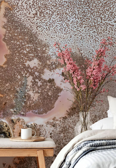
1. Multi-coloured blue/purple geode wallpaper

Mural in photo: The Deep
This beautiful mural by Lara Skinner is a feast for the soul, almost incorporating Pantone’s Colour of the Year 2022 within its kaleidoscope of soothing blues and purples. Geodes are often linked with healing and spiritualism too, with many believing these natural stones can improve mood, create balance and boost energy. Lara Skinner’s The Deep captures the full magic of that.
According to the psychology of shapes, curved lines create a feeling of familiarity and comfort, and can help us unwind, making geode wallpaper a good match for the bedroom.
2. Very Peri botanical wallpaper for relaxation

Mural in photo: Serene Dream
When it comes to creating a tranquil home, there’s no better marriage than a soothing colour like Pantone’s Colour of the Year with some gentle florals. Botanicals in interior design help us connect with nature, doing wonders for our mental health and wellbeing.
Just the sight of floral fractals in home interiors can make us happy, and this Serene Dream mural by Katy Clemmans is a celebration of periwinkle in its prime form. It features delicate floral motifs in the most dramatic watercolour washes, ideal for creating a focal point in communal and family spaces.
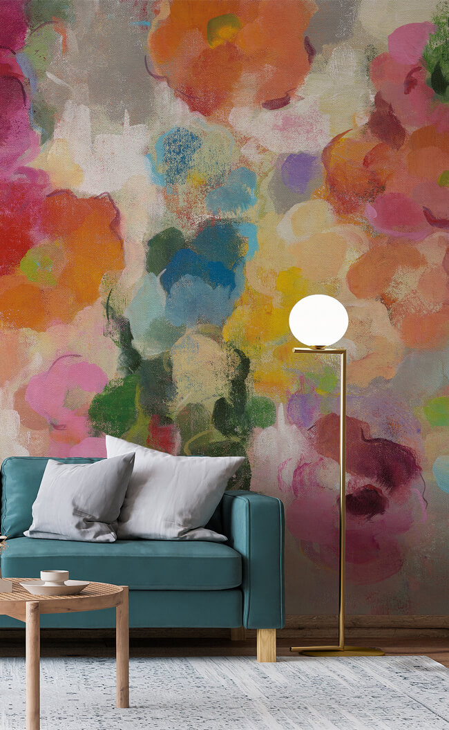
3. Moody florals with a hint of periwinkle

Mural in photo: Purple Foliage
If you prefer deeper, darker, more enigmatic colours for the home, this Purple Foliage mural ticks all the right boxes with the moody florals trend. Stylish, cosy and full of romance, dark botanical wallpapers are perfect for a feature wall. They form a fantastic backdrop to a luxury fabric chaise longue, an art deco sideboard, or a designer dining set.
Bursting with deep mauves and plums, periwinkle is far from being centre stage. But its subtle elegance keeps the design fresh – and it pairs well with the sumptuous gold hue, creating warmth in any room.
4. Hanging eucalyptus garden wallpaper

Mural in photo: Hanging Eucalyptus
We don’t think there’s ever been a dreamier combination than this Hanging Eucalyptus wallpaper, which brings together two important trends for next year. The first being biophilic design and our continued love of greenery in interiors. The second is a nod to Pantone’s Colour of the Year 2022 as we pick out whispers of blues and purples – two shades that can often appear on the same branch as green eucalyptus leaves.
Eucalyptus is also known for its purifying effects, so say goodbye to negative energy and let this uplifting mural set the tone for the brand new year ahead.
5. Blue ink wallpaper for instant impact

Mural in photo: Iceberg
Did you know that in colour psychology, blue is one of the most comforting colours to choose? Blue décor creates a clean, calm environment, and it’s perhaps the most well received shade in interior design. This is because of blue’s ability to please everyone, and its unique knack of making people feel instantly relaxed and safe.
If you want a colour that is conservative and balancing, but you also want a wallpaper that generates intrigue, this Iceberg mural by Katy Smeets is the ultimate hybrid of classic and arty-contemporary. Because who said conservative had to be boring?
6. Pantone's Colour of the Year 2022 goes tropical

Mural in photo: Exotic Birds Journey 2
This Exotic Birds Journey 2 mural is almost a perfect match for Pantone’s Very Peri. With a tropical landscape of leafy foliage and tropical birds, this wallpaper encapsulates everything we love about travel, and reminds us of new places and experiences.
It’s a fitting narrative for the meaning behind Pantone’s Colour of the Year, which is all about embracing future possibilities and rewriting our lives after a global pandemic.
7. Soothing pastel watercolour mural

Mural in photo: Dreamy Pastel and Gold
Soft pinks and muted purples generate real harmony in the home, and this can be further elevated with a touch of gold. With periwinkle’s intriguing and dynamic presence, and the soothing nature of blush pink, this Dreamy Pastel and Gold wallpaper is great for lifting the mood without overstimulating senses.
All colours complement each other in perfect balance, and metallic gold elements can bring both modernity and warmth to your interior story.
8. Periwinkle night scene wallpaper

Mural in photo: Ravens Feather
Inspired by Pantone's Colour of the Year 2022, this Ravens Feather mural almost makes the magical Very Peri hue the star of the show. This abstract scene depicts a moonlit mountain landscape for total escapism and relaxation.
It will look fabulous in any space, but we think it’s particularly effective for the master bedroom, children’s bedrooms or guest rooms that need an instant makeover.
9. Purple/blue meadow wallpaper

Mural in photo: Violet Wild Meadow
When the Pantone Colour of the Year was released, the first thing we thought of was all the spring flowers we’ll expect to see in 2022. The Very Peri hue is of course inspired by the periwinkle flower, but lots of other flowers come to mind – including lavender, salvia, the bluebeard, the waterfall azure mist, monkshood flowers, desert bluebells, grape hyacinth, iris, blue daisies, violets, and many, many more.
This Violet Wild Meadow mural combines everything we love about floral wallpapers with a hint of next year’s most coveted colour, bringing the beauty of nature into the home.
Please note, Wallsauce does not print its wallpapers to Pantone. These designs have been chosen to complement Very Peri.
Do you love Pantone’s beautiful Colour of The Year for 2022? What room would you decorate with this cheerful yet calming hue? Tell us in the comments below, or share your favourite colour trends for next year…
Petter Lauritz Sand
21/02/2022Mindfulness!! Harmonisk Mindful. Innspirert av Natur elementene. Avslapet. Glad et fristed, en av nøkkelsystemene i Feng-Shui naturlig og nøytrale nyanser. Creative farger, blått, grønn, gull, coral rødt, oransje og brunt, duse pasteller. Ønsker tapeter strand og sjø, natur og flora natur blomster eventuelt kirsebær tre greiner med hvite og gul blomster. Lisboa har fine panoramautsikt himmelen og havet? Vennlig hilsen Petter Lauritz Sand Isilda Maria Fernandes Sand
Amy @ Wallsauce
21/02/2022Hei Petter. Hvis du leter etter et oppmerksomt tapet, er 2022s pantonefarge absolutt et godt valg. Hvis du leter etter et spesifikt tapet, hvorfor ikke søke på vårt utvidede utvalg her? - https://www.wallsauce.com/no/wall-murals-wallpaper/extended-range