


Soft, soothing pastels are making a statement this year, appearing everywhere from fashion and accessories to interiors, signalling a growing trend for gentle, uplifting colors.
Pastel colors have always held an important place in interior design, providing a soft, calming palette that transforms a space into a retreat of calm.
The pastel trend is more than a passing style—it’s a versatile approach that brings energy, warmth, and subtle sophistication to any room. Using pastels well means knowing their effect on mood, how they interact with other colors, and where they make the most impact in your home.
Why Pastels Work in Home Decor

Pastel colors—muted pinks, soft blues, gentle greens, and pale yellows—uniquely foster an airy, light ambience. Unlike bold or dark shades, pastels don’t overwhelm a space; they let other elements stand out while providing a soothing backdrop. This makes them perfect for rooms focused on relaxation, such as bedrooms, bathrooms, or reading nooks. Pastels can also make compact spaces look brighter and larger because they reflect light effectively.
Another advantage of the pastel trend is its flexibility. Pastels can be used in traditional, contemporary, or eclectic interiors, blending seamlessly with natural materials, metallic accents, or vibrant feature pieces.
For example, a soft mint green wall can complement warm wooden furniture, while a pale lavender sofa adds a touch of elegance to a neutral living room. Pastels also pair well with patterns—florals, stripes, and geometric designs can all be softened with gentle hues for a harmonious look.
Choosing the Right Pastel Palette

When incorporating pastel colors into your home, it's important to select a palette that suits both your style and the room's function. Softer shades like powder blue, blush pink, and cream are excellent choices for bedrooms and relaxation spaces, as they evoke calm and tranquillity. Slightly stronger pastels, such as peach or aqua, can add personality to kitchens, dining areas, or home offices without feeling overwhelming.
Mixing pastels creates a layered, polished look, but maintaining balance is essential. Pairing several pastel tones requires noting undertones for harmony. Cool pastels, like lilac and mint, coordinate effortlessly, while warm pastels such as apricot and butter yellow foster a cheerful, radiant mood. For a modern twist, combine pastels with neutrals like soft grey, taupe, or off-white for depth and to avoid the space feeling excessively sweet.
Pastels in Different Rooms

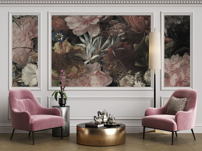
Living Room: Pastels can make a living room feel light and inviting. Consider a pastel mural wall paired with neutral sofas and natural textures, such as rattan or linen. Soft pastel cushions, throws, or rugs allow you to incorporate the trend without committing to a full room makeover. A pastel feature wall behind a statement piece of furniture or artwork can also provide a gentle focal point that draws the eye without dominating the space.
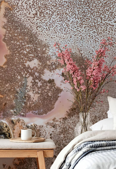
Bedroom: Pastel colors are ideal for bedrooms, as they help create a peaceful, restful atmosphere. Powder blue or mint green walls can enhance a sense of calm, while blush or lilac accents in bedding and soft furnishings add warmth and personality. Pastel tones also work beautifully in combination with natural materials such as wooden floors, wicker baskets, or linen curtains, creating a layered, cozy aesthetic that feels curated yet effortless.
Kitchen and Dining: The pastel trend can refresh kitchen and dining areas in a subtle and stylish way. Mint-green cabinets or soft-yellow walls can add charm and energy without clashing with existing appliances or finishes. Pastel-colored crockery, glassware, or small appliances are another way to nod to the trend while keeping the look flexible and easy to update. In dining rooms, pastel chairs or painted cabinets paired with a neutral table can create a chic, contemporary feel.
Bathrooms: Pastels are particularly effective, as they can amplify natural light and make the space feel clean and spacious. Pale blue, seafoam green, or soft pink tiles can create a spa-like atmosphere, while pastel towels, bath mats, or accessories provide subtle pops of color. Pairing pastels with white fixtures and natural stone finishes enhances the sense of calm and freshness that is central to this trend.
Pastels as Accents and Statement Pieces

While pastel walls can provide a gentle canvas, using pastels as accent colors is often the easiest way to adopt the trend without committing to a large-scale change. Soft cushions, throws, rugs, or lamps can gradually introduce pastel tones and let you experiment with different combinations. Pastel furniture pieces, such as a light-pink armchair or a pale-green sideboard, can become focal points that elevate the room without overwhelming it.
Mix pastels with bold colors effectively with thoughtful combinations. For example, pair a pastel lilac sofa with deep navy or emerald green accessories to create contrast and add drama, while keeping the space modern and playful. Add metallic touches, such as gold or brushed brass, to complement pastel shades, enhancing their subtle elegance and adding sophistication.
Using Pastels Year-Round

A common misconception is that pastel colours are only suited to spring or summer interiors. In reality, pastels can be styled for any season. During colder months, layering pastel tones with rich textiles, such as velvet cushions, wool throws, or darker wood accents, can create warmth and depth.
In the summer, lighter furnishings and airy curtains can amplify the fresh, breezy feel of pastel colors, making your interiors feel bright and uplifting year-round.
Avoiding Common Mistakes

Using pastels effectively means avoiding washed-out or overly sweet results. One tip is to vary the intensity and saturation of your colors. Mixing very soft pastels with more saturated hues creates visual interest and avoids monotony.
Adding texture also helps pastels feel rich and layered—think linen curtains, boucle cushions, or a woven rug. Lighting also plays a crucial role. Pastels can appear different depending on whether a room receives natural or artificial light. Testing paint swatches on walls and observing them at different times of day ensures the colors behave as intended and maintain their soft charm without appearing dull.
The Timeless Appeal of Pastels

Ultimately, the pastel trend endures because it balances versatility with aesthetic appeal. Pastels create interiors that feel gentle, welcoming, and easy to live in, while still offering opportunities for creativity and individuality.
Whether you are refreshing a single room, adding subtle accents, or committing to a fully pastel-themed space, these colors can make a home feel harmonious, cheerful, and effortlessly stylish. By understanding how pastels work in different rooms, mixing and layering tones thoughtfully, and pairing them with textures, neutrals, or metallics, you can embrace this trend successfully.
Pastel colors are not just a fleeting decorative choice—they offer a lasting way to create interiors that feel bright, airy, and full of understated charm.
Latest Social