


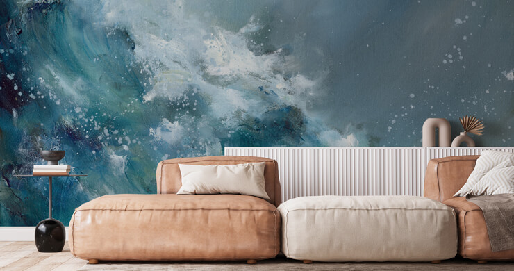
Color is set to take a confident turn in 2027. After years of soft neutrals, muted greens and understated palettes dominating interiors, we're seeing a shift towards shades that feel more expressive, optimistic and full of personality.
But 2027 isn't about one color taking over. Instead, we're embracing a much more eclectic approach, mixing rich, vibrant shades with unexpected color combinations and plenty of personality. The result? Interiors that feel layered, individual and confidently expressive, with fewer rules and a lot more room to make your space your own.
Whether you're planning a complete room makeover or simply looking for inspiration for your next feature wall, here are some of the key color trends to watch in 2027.
Rich Claret
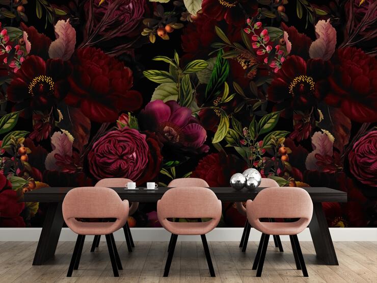
Burgundy shades are bringing a rich, confident feel to interiors in 2027, adding depth without the intensity of brighter reds. This deep wine-inspired shade works particularly well in spaces designed for relaxing and entertaining, creating a cozy and sophisticated atmosphere across living rooms, dining rooms and bedrooms.
Pair it with warm beige and natural wood for a softer look, or contrast it with blush pink and lighter neutrals to give the color a more contemporary edge. Claret works beautifully as a splash of color in a lighter, neutral room, adding depth and personality without overpowering the overall scheme.
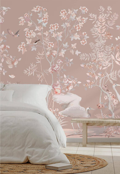
Rose Blush
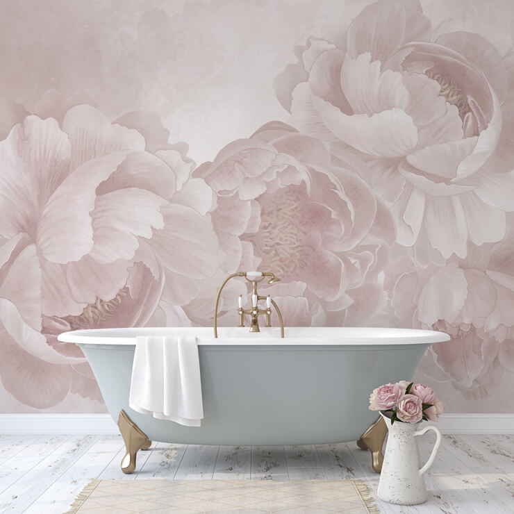
Blush pink continues to offer a gentler way to embrace colour in 2027. Warm, delicate and incredibly versatile, it can create a calm and welcoming feel without making a room appear overly sweet.
Blush works beautifully with earthy neutrals, natural greens and even white, while pairing it with deeper shades gives the colour a more grown-up feel. Whether used as a subtle backdrop or woven through a room's accents, this understated pink brings warmth and softness to any space.
Pine Green
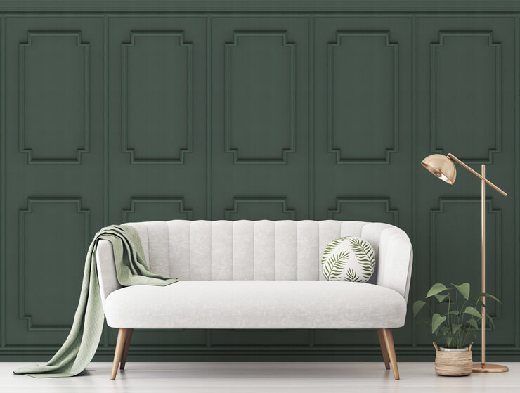
Dark green is taking the connection to nature a little deeper in 2027. Expect to see the color becoming richer and more grounded, moving beyond the softer sage tones that have been popular in recent years.
Rich forest, pine and evergreen shades bring an enveloping quality to interiors, making walls feel dramatic while still retaining a sense of calm. They're particularly effective in rooms where you want to create a cozy, cocooning atmosphere, and look striking against lighter furniture and warm natural materials. A deep forest shade can transform a living room into a dramatic retreat.
Cobalt Blue
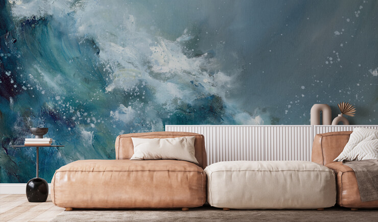
Deep blue is bringing a sense of drama and depth to interiors in 2027. Rich, inky shades can make a room feel instantly more sophisticated, creating an atmosphere that's particularly suited to bedrooms, living rooms and dining spaces. While deep blue can certainly make a statement on its own, it also works beautifully alongside warm neutrals, natural wood and touches of brass or gold.
Blue is set to remain a major player in interiors, but 2027 is bringing a bolder take on this timeless shade. Look out for vibrant, luminous blues alongside deeper ocean tones, rich cobalt and atmospheric blue-gray shades. Unlike softer pastel blues, these more energetic shades bring character to a room. They can be used to create a dramatic feature wall or balanced with warmer colors and natural materials for a more relaxed feel.
Modern Marigold
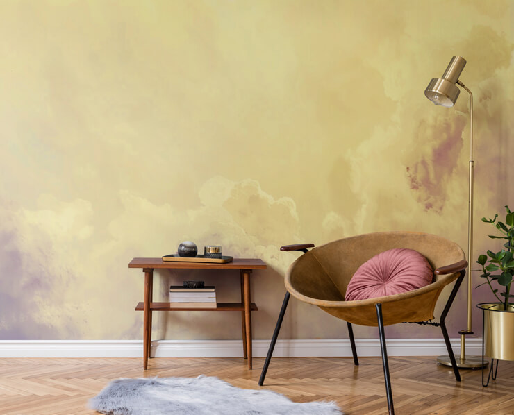
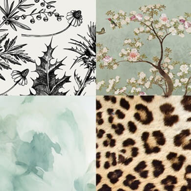
Abstract Pale Yellow Clouds mural
Yellow is bringing a much-needed dose of optimism to interiors in 2027. From soft, sunny shades to richer golden tones, this cheerful color can instantly lift the mood of a space and make it feel brighter and more welcoming.
Rather than reserving yellow for small accents, we're seeing it take centre stage on walls, where it can create a wonderfully uplifting backdrop. Pair it with natural greens and earthy tones for a look inspired by the outdoors, or embrace its playful side alongside pinks, blues and other vibrant shades.
Mulberry Tones
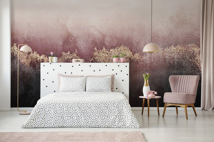
Deep purple is taking on a richer, more sophisticated feel for 2027, with blackberry, plum and mulberry tones bringing plenty of character to interiors. These moody shades have a luxurious quality that makes them perfect for creating atmospheric spaces, particularly when used across a feature wall.
Despite their depth, they don't have to feel overly traditional; pair mulberry purple with soft beige, warm pink or earthy brown for a more contemporary look. Used effectively, these rich tones can add a beautiful sense of depth and intrigue.
Warm Stone
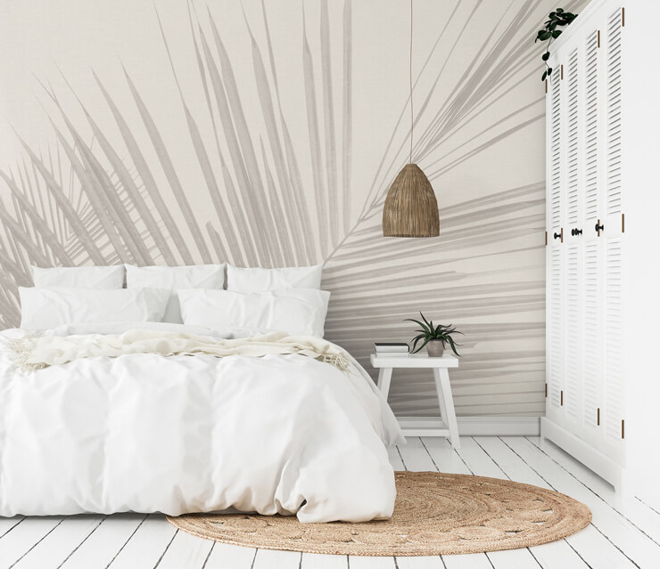
Monochrome Tropical Palm Leaves mural
For those who prefer a quieter palette, limewash-inspired beige is bringing softness and texture to interiors in 2027. Think chalky, sun-washed tones with subtle variations that give walls a beautifully lived-in quality.
Far from feeling plain, these warm neutrals create a versatile backdrop that allows furniture, artwork and bolder accents to take centre stage. They work particularly well alongside natural materials, helping to create interiors that feel relaxed, understated and effortlessly timeless.
Aged Ochre
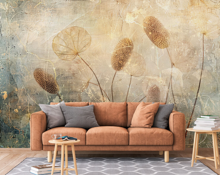
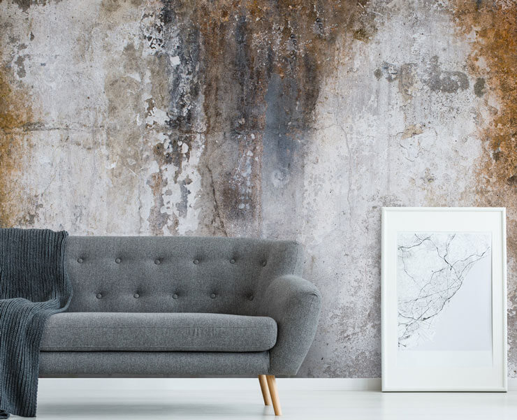
There's also something nostalgic about the faded brown-orange tones of old, tea-stained paper. Somewhere between muted terracotta and antique sepia, this earthy shade brings a sense of age and character to contemporary interiors.
It feels particularly at home alongside vintage-inspired patterns, aged woods and other natural materials, but can also be used to warm up a more modern space. This is a shade that helps to bridge the gap between styles from different eras. Blend old and new beautifully with aged ochre in 2027.
Color Combinations Take Centre Stage
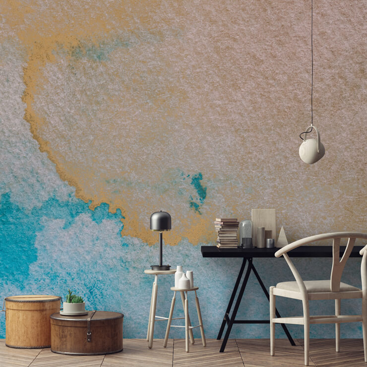
Perhaps the biggest color trend for 2027 isn't a particular shade at all. It's the way we're using color. Instead of choosing one dominant color and building an entire room around it, we're becoming more confident about mixing contrasting and complementary shades.
Blue with orange. Pink with green. Deep red with soft beige. Forest green with warm yellow. The key is creating balance. A bold color doesn't necessarily need to cover an entire room. It can appear in a mural, a feature wall, a piece of furniture or a few carefully chosen accessories. This approach also makes it much easier to create a home that feels personal rather than overly coordinated.
How to Embrace the 2027 Color Trends
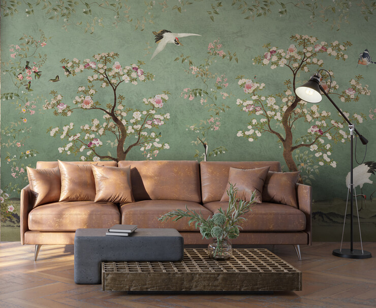
Mint Green Lingering Garden Chinoiserie mural
You don't need to completely redecorate your home to get ahead of the 2027 color trends. Start small by introducing one new shade through cushions, artwork, accessories or a statement piece of furniture.
For a bigger transformation, a feature wall or mural can instantly introduce colour and personality. Because murals often combine several shades within one design, they're a particularly easy way to experiment with color combinations without having to choose just one paint color.
From bold abstract designs and colorful landscapes to botanical scenes and atmospheric skies, there's a mural to suit every interpretation of the 2027 color palette.
Ultimately, the biggest trend for 2027 is color confidence. Whether you prefer calm and earthy interiors or bold, joyful spaces, it's all about choosing shades that make your home feel like you. So, if you've been waiting for the right moment to add a little more color to your walls, 2027 might just be the year to go for it.
Which of these color trends are you most interested in? Do you think there's a shade we've missed? Get involved and let us know in the comments below.
Latest Social